TextImageOverlay
Text over an image is the pattern every content-managed site converges
on, and the one where two editors — the one who picked the photo and
the one who wrote the headline — silently share responsibility for a
contrast ratio neither can see. Below: five techniques against five
deliberately hostile images. Every cell's badge is a real measurement
(npm run contrast samples the image region under the text
and applies the technique's overlay math), not an assertion. The
long-form version of this argument is in
the post
. The interactive version — bring your own image — is the
playground
.
Badges measure the average color of the sampled region — a deliberately blunt instrument. The point of the matrix is that even the blunt instrument catches most of what eyeballs miss.
Gradient
A directional eased scrim anchored at the text. The default — spends the least image to buy the most contrast.

Summer hours start Monday
Everything an editor loves about this photo is what kills the headline.

Field notes, third season
High-frequency detail everywhere the letterforms need quiet.

After-hours access
The easy case. Every technique looks competent here.

Golden hour, extended
Half this frame is on the headline’s side. Half is not.
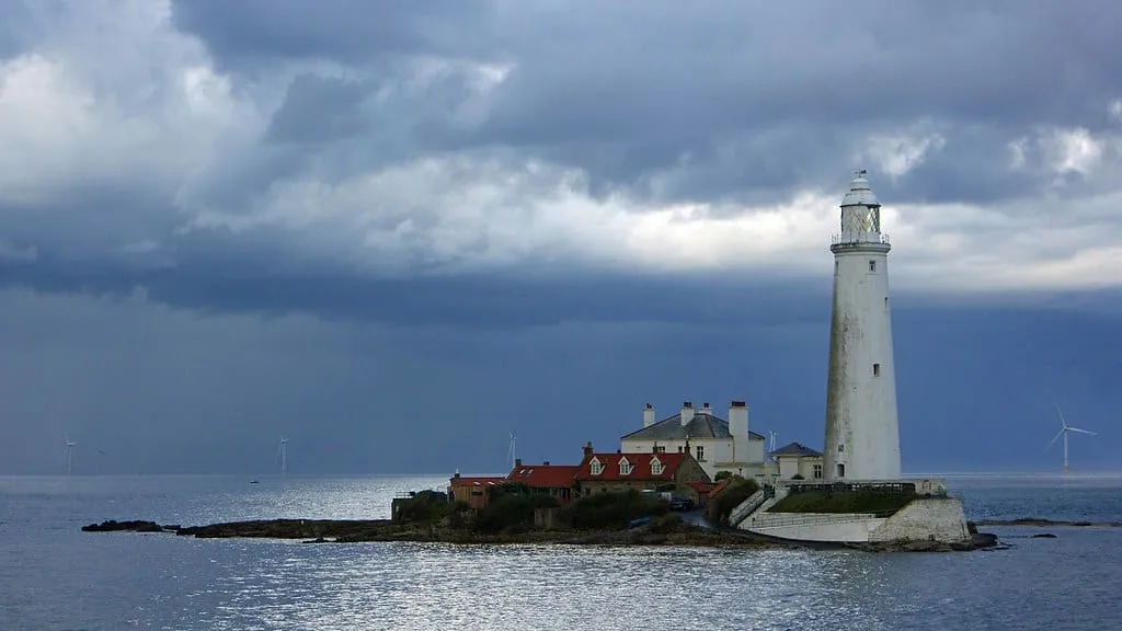
The last keeper left in 1990
The subject lives where the crop goes first.
Overlay
A flat 40% wash over the whole frame. Predictable, position-independent, and it dims the photo everywhere including where it did not need to.
Summer hours start Monday
Everything an editor loves about this photo is what kills the headline.
Field notes, third season
High-frequency detail everywhere the letterforms need quiet.
After-hours access
The easy case. Every technique looks competent here.
Golden hour, extended
Half this frame is on the headline’s side. Half is not.
The last keeper left in 1990
The subject lives where the crop goes first.
Letterbox
Text on a solid plate pinned to the bottom edge. The image never touches the contrast math — the plate always wins.
Summer hours start Monday
Everything an editor loves about this photo is what kills the headline.
Field notes, third season
High-frequency detail everywhere the letterforms need quiet.
After-hours access
The easy case. Every technique looks competent here.
Golden hour, extended
Half this frame is on the headline’s side. Half is not.
The last keeper left in 1990
The subject lives where the crop goes first.
Shadow
Text-shadow only, no scrim. Reads as most integrated with the photo and is the only technique with no floor under it.
Summer hours start Monday
Everything an editor loves about this photo is what kills the headline.
Field notes, third season
High-frequency detail everywhere the letterforms need quiet.
After-hours access
The easy case. Every technique looks competent here.
Golden hour, extended
Half this frame is on the headline’s side. Half is not.
The last keeper left in 1990
The subject lives where the crop goes first.
Blur pad
A frosted plate behind the text block. Localized like letterbox, softer than overlay; degrades to a translucent tint without backdrop-filter.
Summer hours start Monday
Everything an editor loves about this photo is what kills the headline.
Field notes, third season
High-frequency detail everywhere the letterforms need quiet.
After-hours access
The easy case. Every technique looks competent here.
Golden hour, extended
Half this frame is on the headline’s side. Half is not.
The last keeper left in 1990
The subject lives where the crop goes first.
How it breaks
The matrix shows techniques behaving. These are the CMS failure modes — the ways real content defeats a template that demoed beautifully.
The lucky corner
Same image, same technique. The editor chose well.
Text over the dark wall: shadow gets away with it. 15.12:1 AAA
The unlucky corner
Same image, same technique. The editor moved the text.
Text over the sun itself: nothing under the letterforms but glare. 1.59:1 fails WCAG
One component, three homes
Sidebar, column, hero — the same instance, honest at each size.
One component, three homes
Sidebar, column, hero — the same instance, honest at each size.
One component, three homes
Sidebar, column, hero — the same instance, honest at each size.
Resize this window
Wide: cinematic crop. Narrow: portrait crop. Same text, different pixels.
University announces revised parking enrollment procedures for returning faculty, staff, and affiliated contractors effective this fall
The comp had four words here.
A beautiful day
The editor picked the photo for its brightness. The template kept it.
When to use which
- Gradient
- Default. One busy area, one quiet area — anchor the text in the quiet one.
- Where it lies: On uniformly bright images the ramp costs most of the photo before the number clears.
- Overlay
- When the image is decoration and the text is the point.
- Where it lies: It reads as reliable but a 40% wash still struggles on a blown-out frame — and dims the good ones.
- Letterbox
- When contrast must be guaranteed and the image can end where the text begins.
- Where it lies: It never lies about contrast. It lies about being the same design the comp showed.
- Shadow
- Short labels on images you control and have actually looked at.
- Where it lies: It has no floor. The same settings pass on one upload and fail on the next.
- Blur pad
- Busy images where a local plate beats a global wash.
- Where it lies: Its contrast depends on what it happens to be blurring — the measurement is per-image, not per-technique.