Text over images is a CMS problem, not a CSS problem
6 min read
Every content management system eventually grows a component that puts a headline on top of a photo. The photo comes from one editor, in March. The headline comes from a different editor, in October. A template composites them at whatever width your phone happens to be, and the contrast ratio that results belongs to nobody. Three people made a decision together and none of them were in the room.
I’ve been building versions of this component for most of my career, across a university design system and a string of content-managed marketing sites. I have never mastered it. I’ve gotten far enough to know where all the bodies are buried, and this site now has a lab page that digs them up on purpose.
The ways it breaks
The failures compound because each one is owned by a different person.
The crop moves the subject. object-fit: cover keeps the box full at any ratio by throwing away image. Which part it throws away depends on the box, and the box depends on the layout, and the layout depends on the viewport. The lighthouse your editor centered in the photo is the first thing a portrait crop amputates.
The breakpoint moves the text. A layout that renders 21:9 on desktop and 4:5 on a phone is showing the same image twice with two different crops, and the headline lands on different pixels in each.
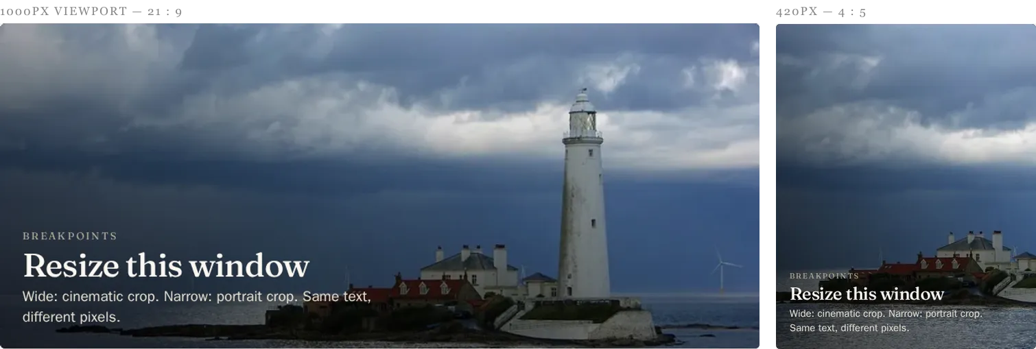
The designer approved the one on the left. The phone got the one on the right: the crop threw the lighthouse away, and the headline slid onto brighter water while it happened. Nobody touched the content. There’s a live version in the lab you can resize yourself.
The headline is a free variable. The comp said four words. The editor needed twenty-three, because the provost’s office had requirements. The scrim was tuned for the comp.
Light or dark text is a per-image judgment. No global template setting gets this right, because the correct answer lives inside each photo. A CMS that offers the toggle has delegated a design decision to whoever is closest to the deadline.
And “just add a scrim” is not one fix. It’s at least five, and each one lies to you in a different spot. A gradient scrim spends the least image but costs the most on uniformly bright photos. A flat overlay dims the whole frame including the parts that were fine. A letterbox plate guarantees contrast by refusing to put text on the image at all, which is also its design problem. Text-shadow has no floor under it. A frosted blur pad inherits whatever happens to be behind it. The lab renders all five against five deliberately hostile images so you can watch each one hit its wall.
Brightness math
The part of this I’d actually defend in a code review is the measurement. This site has a script, npm run contrast, that knows about every overlay demo. For each one it samples the average color of the image region under the text, applies the technique’s overlay math on top of that sample, and computes the WCAG contrast ratio of the text against the result. Every cell in the lab wears its measured number as a badge.
Better: each demo declares what it expects. expected: 'pass', expected: 'fail'. The script exits angry when measurement disagrees with the declaration, which turns the whole page into a regression test. The intentional failures stay failing. If a future image swap accidentally rescues one, the build says so.
Some numbers from the current run. White text with only a text-shadow, centered on a blown-out cloudscape, measures 1.65:1. The same shadow technique on the same sunset photo measures 15.12:1 in the dark corner and 1.59:1 in the corner with the sun in it; the only difference between those two demos is where the editor dragged the text. The letterbox plate measures 16.45:1 on every image, because the image was never invited.
The math also lies, and I made it confess. There’s a photo of lichen colonies on dark rock in the matrix (mine, from the Maine coast) where text-shadow measures 12.5:1. AAA, says the badge. Your eyes say soup. The sample is an average, and an average can’t see noise; a thousand bright speckles vanish into a dark mean while doing real damage to letterforms. The caption on that cell says the badge is lying. I left it that way because a measurement you trust past its accuracy is worse than no measurement.
While I’m confessing: partway through building this I spent an evening chasing a Lighthouse performance score, and most of what I fixed existed only inside Lighthouse’s network simulation. Real users painted the page in a tenth of a second the whole time. Brightness math, lab scores, contrast badges: all of it is a model, and a model is only honest about the things it models.
What editors actually deserve
Content management systems mostly hand editors the sharp end of this. An image field, a text field, a preview that shows one viewport, good luck. The tooling that would help has existed for years: a focal-point picker so the crop knows what the subject is, a preview that shows every breakpoint at once instead of the lucky one, and a contrast warning inside the edit form, computed from the actual image and the actual headline, before publish. I’ve watched editors get blamed for “bad photo choices” on sites where the edit form gave them a thumbnail and a prayer.
The measurement above is a build-time version of that warning. The interactive version, where you pick an image, drag the text around, and watch the number change as you ruin things, is the follow-up project.
Prior art, with apologies
A long time ago I worked on a university design system, and it had one of these components. I named it inset pet. I was naming things with a portmanteau generator at the time; some colleagues were doing work for a linguistics researcher on campus, language generators were briefly the coolest thing in the building, and I regret nothing. The same era produced “Lumastache,” which shipped, and “Lightsaber link,” which got cut. Eventually they stopped letting me name things, and that’s probably for the best. (It didn’t take. The mobile menu on this site is a clam that opens when you tap it. I call it the clamburger.)

The inset pet is white serif type over whatever sky the editor picked, which is to say it’s the exact problem this whole post is about, shipped with confidence a decade before I could measure it.
The call-to-action patterns from that system took the opposite road: duotones. CSS filters were newly capable of it, generator tools on the web would build the color maps for you, and a duotone collapses an image’s entire tonal range into two known colors. Text contrast stops being a measurement and becomes a property of the construction. You pay for it in photography (everything is suddenly very brand-colored) but the headline cannot lose.

That’s the real fork in this pattern, and it took me years to see it plainly: either you constrain the image until contrast is predictable, or you measure the unconstrained image and report the damage. The duotone CTAs did the first. My matrix does the second. Most CMS components do neither, which is how you end up reshooting a photo because the headline was white.
The playground comes next. Bring a hostile image.
Glossary
- WCAG — Web Content Accessibility Guidelines
- The web accessibility standard Section 508 points at. Levels A through AAA, with AA the working target for government sites. Source